United Refrigeration Inc.
URI is one of the largest distributors of refrigeration, air conditioning, and heating parts and equipment in North America. Serving contractors at 400 locations across the region, and online.
They went through a website redesign with The Durkan Group, and over time, decided some parts needed updating. Customer usability difficulties were a primary concern, along with desires to improve pages visually or include new pages to provide users with new information in the industry. These updates included small UI tweaks to larger UX/UI reworks.
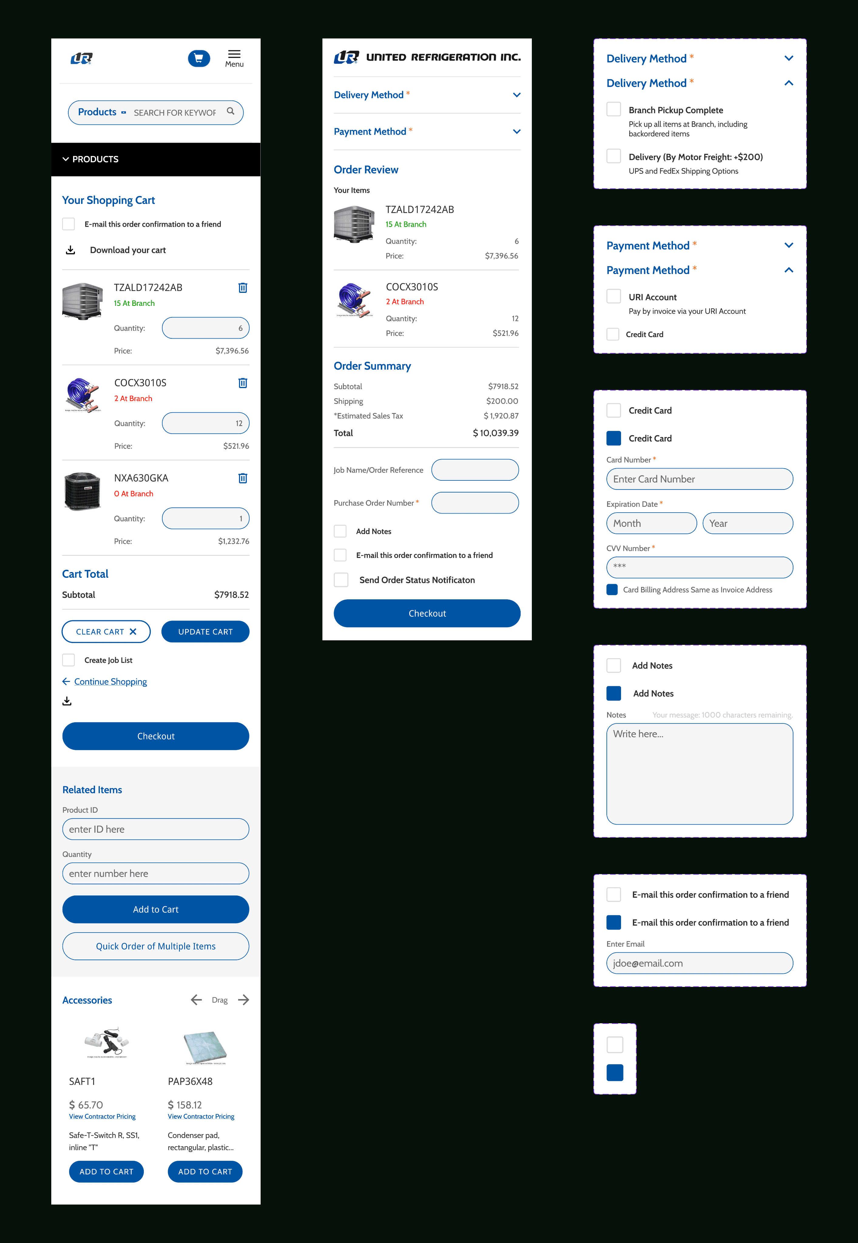
A mobile checkout update, simplifying by removing unnecessary information, and adjusting the hierarchy so the products and prices were the main focus for customers.
I collaborated with the team on the URI account for all sizes of projects. At the start of many, we would begin by auditing the current process or elements that were being reworked. We would point out potential problems with the current systems, and compare that to the client’s brief and what issues they observed. This way, we could identify any issues that might be causing problems for the users, whether the client realized them or not.
I audited category and product pages and cleaned them up so information would be easily digestible for customers. Adjusting content hierarchy, condensing and reorganizing information on the product availability page key parts of this project for the client.

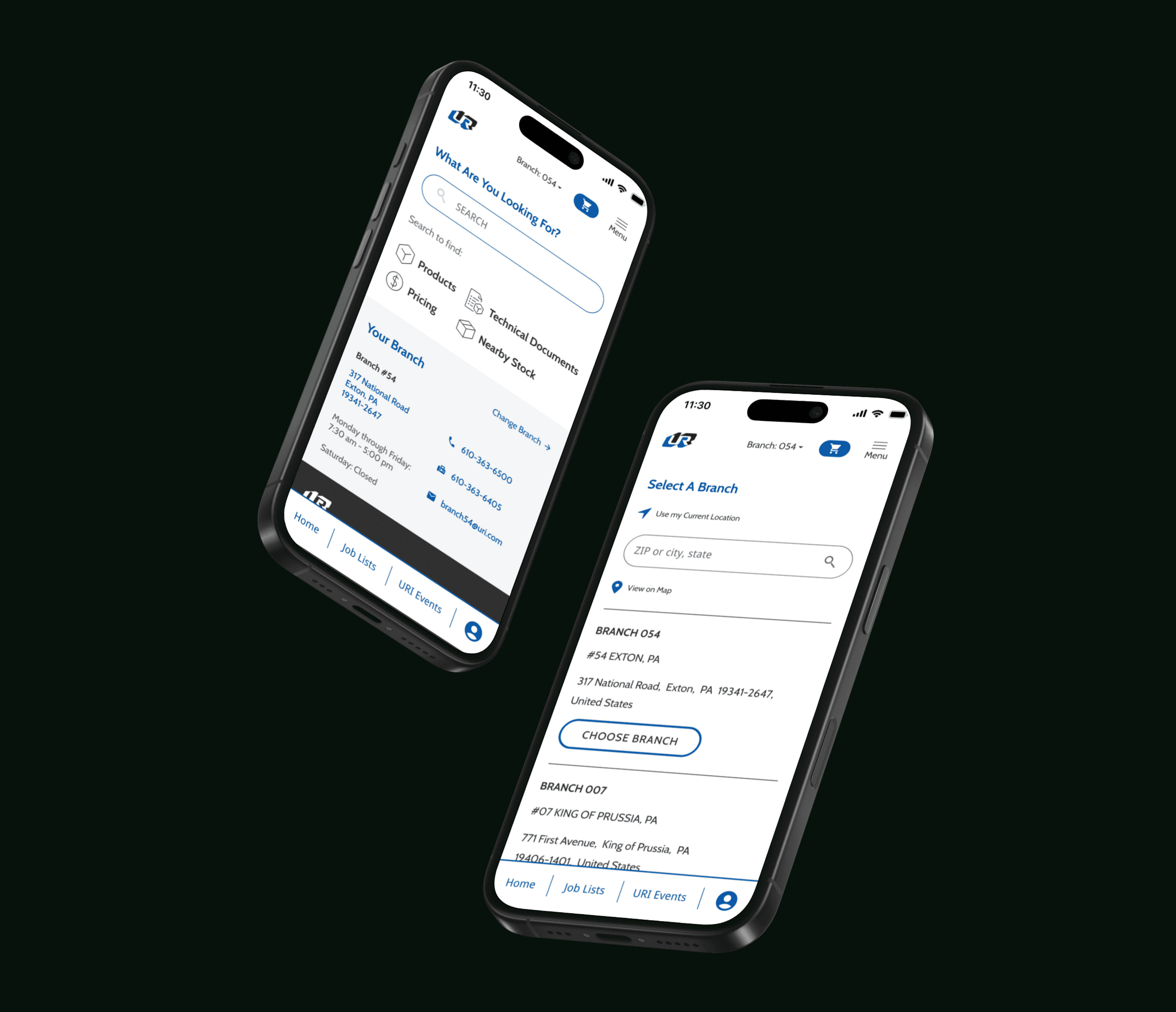
One example of this process working was during an update to the mobile homepage. The client requested updates to the mobile site, they received feedback and complaints from customers that it was difficult to use and find what they were looking for. We took it a step further and after checking for points of friction on the mobile home, we went through a user flow to find out how it felt navigating through the product categories and getting to products. We went to the client with their requested homepage updates, and also our findings on the mobile product flow and they loved the idea of updating that as well. Our process helped us secure additional work and helped make the clients site better in one move.
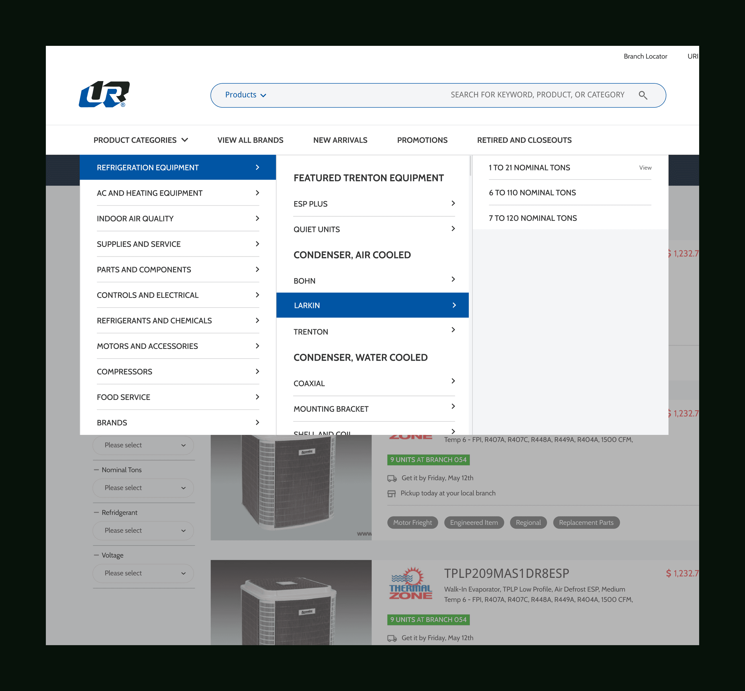
A new navigation for the website, condensing products to a single space, allowing for additional links like new arrivals, and promotions. Previously the client wanted all product categories displayed individually which they eventually realized took too much space.
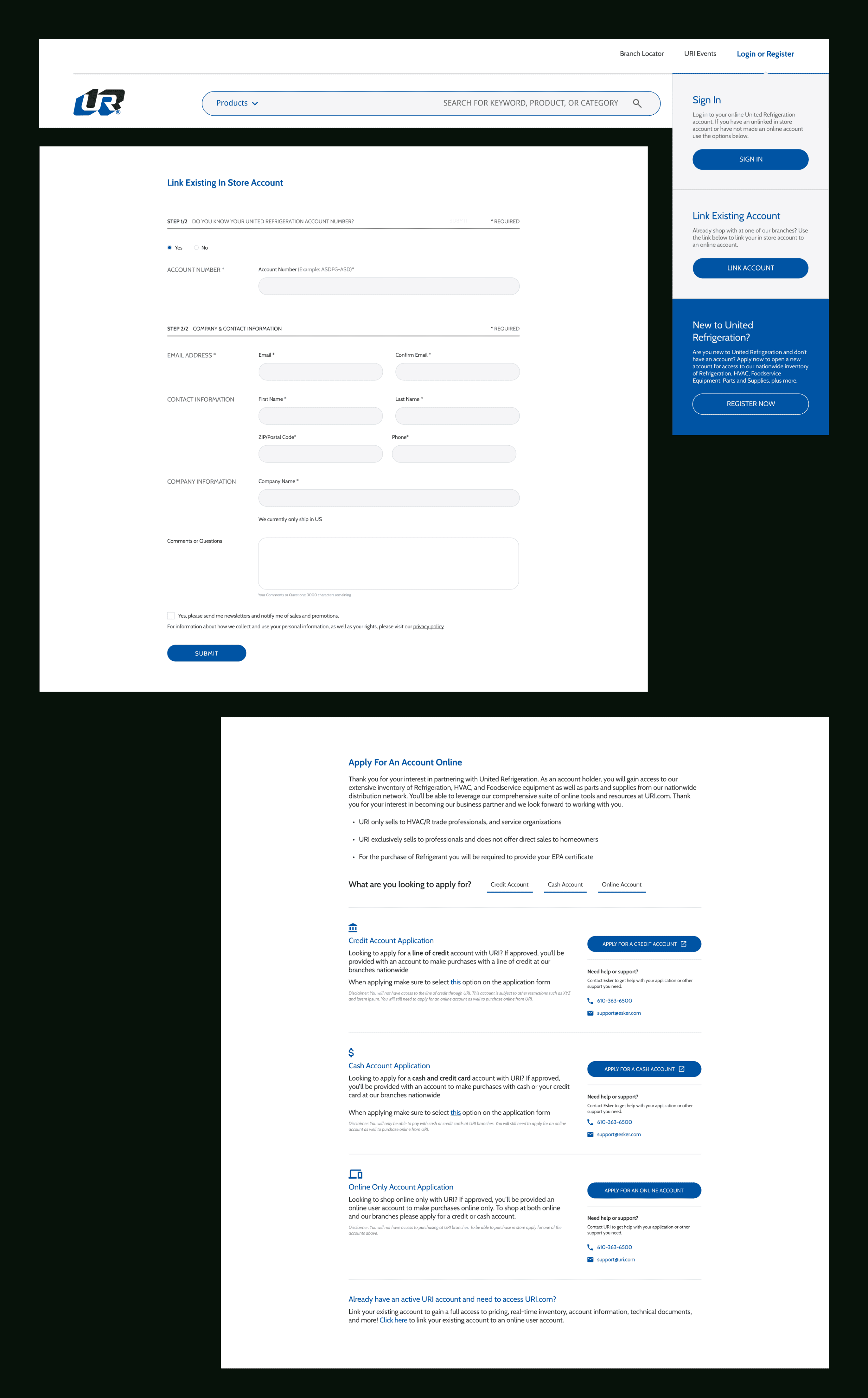
Account creation updates to remove a large point of friction for customers. The previous registration flow didn't do much besides create a simple online account and customers had to do a second more in depth account creation in store after. This new registration flow helps customers sign up once and also sign up for the correct account.